Blog · Behind the data · August 24, 2026
How to spot an elite high school in the data
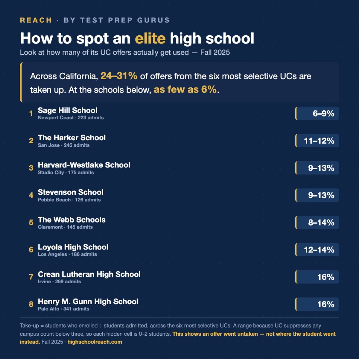
You can identify an elite high school from public data. It just takes two numbers rather than one, and the second one is the number nobody publishes.
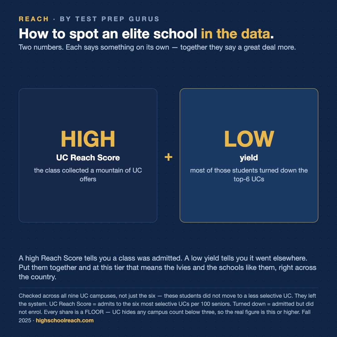
The first is the UC Reach Score: admits to Berkeley, UCLA, San Diego, Santa Barbara, Irvine and Davis, per 100 seniors. A high score means the graduating class collected a great many UC offers. That is the number our league tables are built on, and it is the one schools quote.
The second is yield — what share of those offers turned into enrolments. Low yield is the same fact stated the other way round: most of them were turned down. Across California it runs between 69% and 76%. That sounds alarming and mostly isn't, for an unremarkable reason: a student admitted to four campuses can only enrol at one, so three of those offers are turned down by a kid who is perfectly happy with the fourth.
Each number says something on its own, and together they say a great deal more. A high Reach Score with ordinary yield describes a strong school whose graduates go to the UCs — a fine outcome, and the one most families are after. Low yield on a low Reach Score describes a school that had few offers to begin with. It is the combination of a high score and a low yield that identifies something particular.
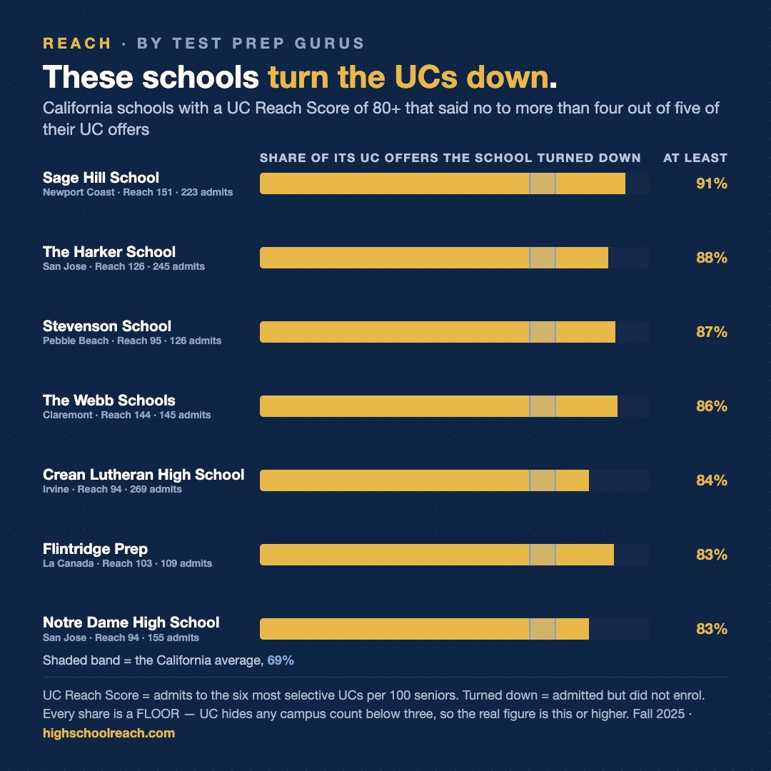
Nineteen California schools posted a Reach Score of 80 or better on at least 100 admits in Fall 2025. Seven of them show a turn-down rate above 82%.
Sage Hill School in Newport Coast leads on both counts: a Reach Score of 151 from 223 admits, and 91% of those offers turned down. The Webb Schools in Claremont, Reach 144 and 86%. The Harker School in San Jose, 126 and 88%. Stevenson School in Pebble Beach, 95 and 87%. Flintridge Prep in La Cañada, 103 and 83%. Crean Lutheran in Irvine, 94 and 84%. Notre Dame in San Jose, 94 and 83%.
The first objection to that list is a good one: maybe those students just took a less selective UC. Merced, Riverside and Santa Cruz are not in the six, so a student who turned down UCLA for Riverside would look like a departure when they never left.
They didn't. The turn-down rate computed across all nine UC campuses is identical to the top-six figure for every school named above. There is no shuffle hiding inside the system. Those classes left it.
Which leaves the obvious question of where they went, and here we have to be careful about the difference between what we can prove and what is simply clear. We hold no enrolment data outside the UC system. What we can show is that a student was admitted to one of the most selective public universities in the country and declined, and did not take any other UC either. At this level of outcome the destinations are the Ivies and the schools that compete with them, across the country. That is an inference. It is a very strong one, and we are not going to pretend it is a measurement.
One more caveat on the figures themselves. Every turn-down figure above is a floor, not a point estimate. UC suppresses any per-campus enrolment count below three students, so a hidden cell holds 0, 1 or 2 and there is no way to tell which. We publish the conservative end — the share each school turned down is that number or higher.
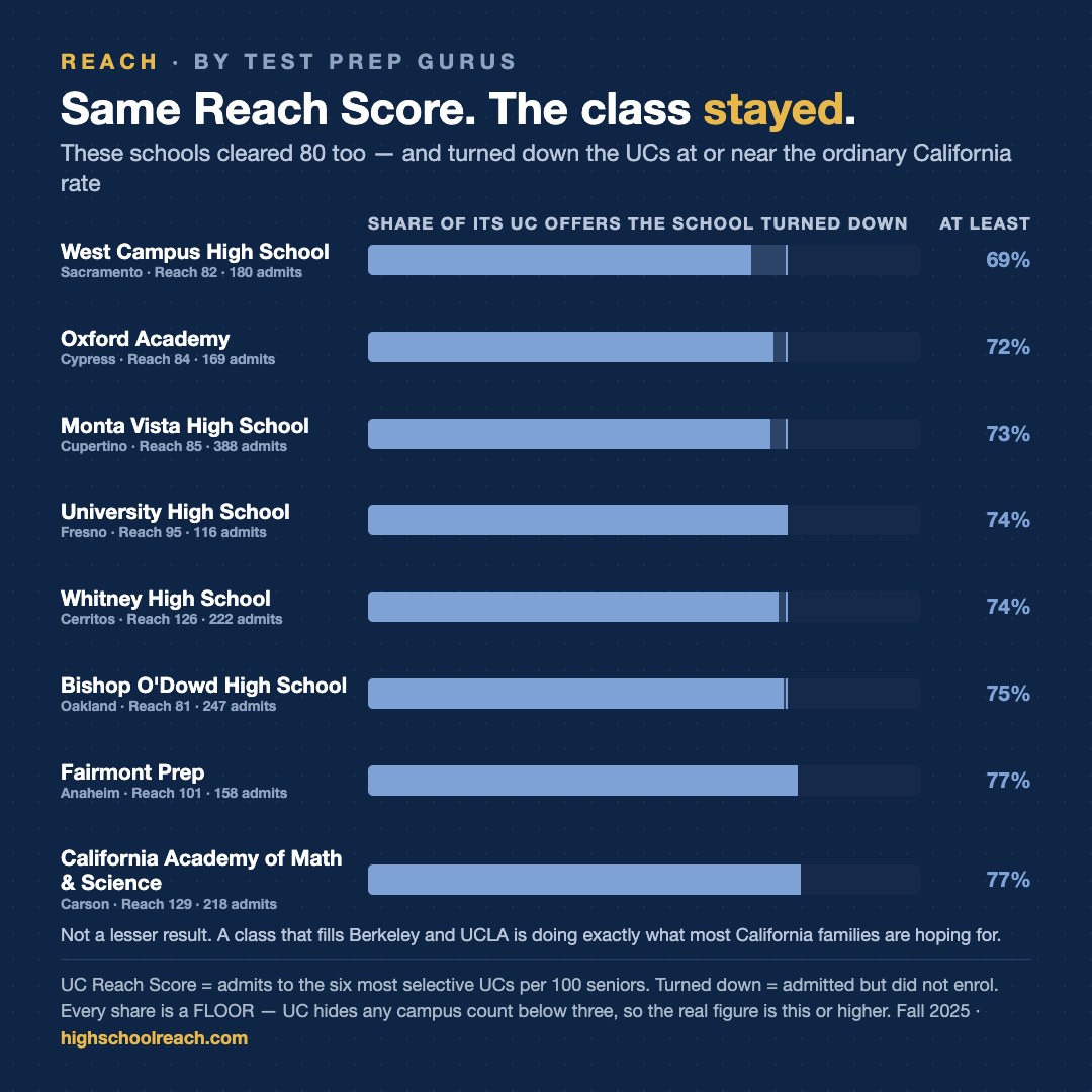
Finally, the part that is easy to get wrong. The schools on the other side of this — Whitney, Canyon Crest, Lynbrook, Monta Vista, Orange County School of the Arts, California Academy of Math and Science — are not producing a lesser result. Several post Reach Scores in the same range and turn the UCs down at the ordinary California rate or below — West Campus at 69%, Oxford Academy 72%, Monta Vista 73%, Whitney 74%. A class that fills Berkeley and UCLA is doing precisely what most California families are hoping for, and at a fraction of the cost. These are two different outcomes. Only one of them is a ranking, and it isn't this.
Every California high school's page carries its own admit and enrolment figures, and the methodology page explains how the Reach Score is built.